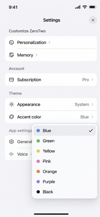
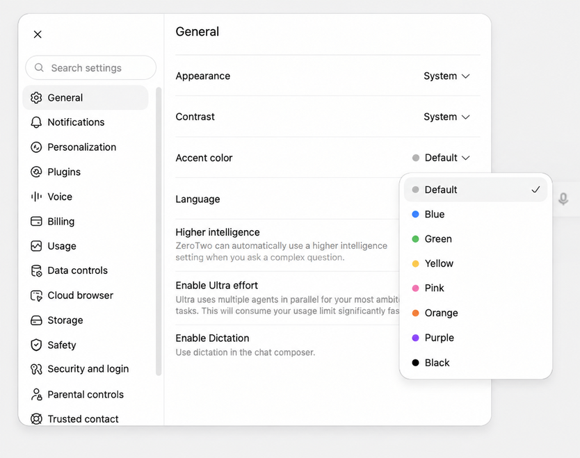
The Appearance page in Settings controls how ZeroTwo looks: light or dark mode, a color theme, the accent color, contrast, fonts and a few display preferences. Changes apply as soon as you make them and are saved to your account settings.
Open Appearance
- Select your name at the bottom of the sidebar to open the account menu.
- Choose Settings.
- Choose Appearance in the list of tabs.
On the web, Settings opens as a dialog. In the desktop app it opens as a full page.
Choose light, dark or system
Under Theme, pick one of three preview cards: System, Light or Dark. System follows your device. The card below the previews is headed Light theme or Dark theme, depending on which mode is showing, because each mode keeps its own colors.
Pick a theme and accent color
The theme card has these controls:
- Theme dropdown (it shows the name of the current theme). Choose a ready-made theme such as Default, Catppuccin, Everforest, GitHub, Gruvbox, Linear, Notion, Solarized or Vercel. Choosing one replaces the colors and the fonts with that theme's, or with the default fonts when the theme sets none. To return to the original colors and fonts, choose Default.
- Accent. Choose a preset (Default, Blue, Green, Yellow, Pink, Orange, Purple or White) or choose Custom and type a six-digit hex color.
- Background and Foreground. Type a hex color for each.
- Translucent sidebar. Switch the sidebar's see-through look on or off.
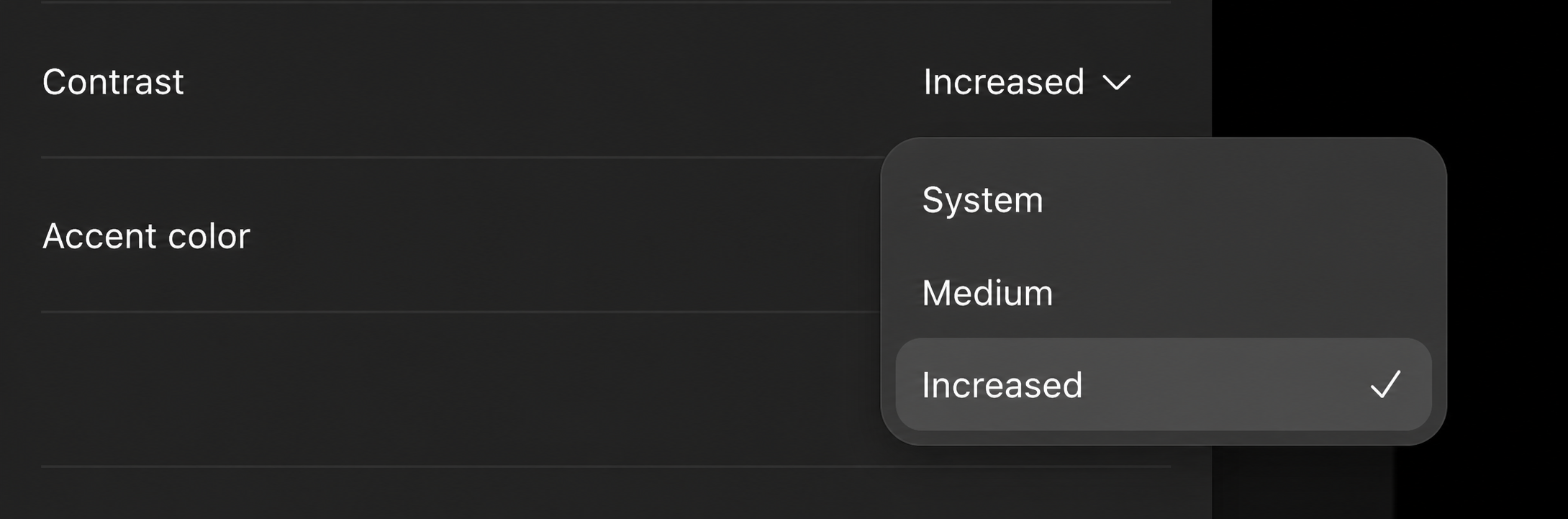
- Contrast. Drag the slider anywhere from 0 to 100.
Import or copy a theme
Choose Import to open the Import theme dialog. Give the theme a Name, paste its Theme JSON, then choose Save theme. It is added to the theme dropdown. Choose Copy theme to copy your current theme settings to the clipboard as JSON.
Change fonts and sizes
Three rows set the typeface, each with a family menu and a style menu: UI font, Content font and Code font. The content font can be set to Same as UI font. Under Preferences, UI font size accepts 10 to 24 and Code font size accepts 9 to 24.
Other display preferences
| Setting | What it does |
|---|---|
| Use pointer cursors | Show a pointer cursor over interactive elements. |
| Rich editor | Render Markdown as formatted text in the message box while you paste and type. |
| Dock icon | Choose the Light or Dark app icon. Shown only in the macOS desktop app. |
| Reduce motion | Choose System, On or Off for animations. |
| Diff markers | Show changed lines with colored bars (Color) or with +/- symbols. |
| Font Smoothing | Use native macOS font anti-aliasing. |
| Action buttons | Choose which buttons appear under messages: Reaction, Switch model and rerun, Share, Copy, Branch, Read aloud and Delete message. |
| Sidebar | Choose which sections the sidebar shows: Characters, Projects and Recents. |
On iPhone, iPad and Android
The mobile apps have a shorter version of this page. On iPhone and iPad it is Settings > Appearance, with the System, Light and Dark cards, Accent, the three font rows, Rich editor, Reduce motion, Action buttons and Sidebar. Android has no separate Appearance page: its Settings screen has a Theme group with the same three cards, an accent color and the three font rows, and a Preferences group with Rich editor, Reduce motion and Sidebar. Its Message icon visibility row covers the action buttons.